[youtube https://www.youtube.com/watch?v=3HSH8dj2VRE]
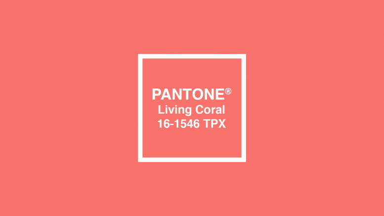
Tickle me pink – or ‘Living Coral,’ to be exact: coral has been deemed Colour of the Year by Pantone.
With every day seeming to bring a new headline about how the world is breaking down, Pantone knows what humanity needs as 2018 comes to a close — a Colour of the Year that reflects ‘warmth and nourishment to provide comfort and buoyancy.’
Introducing the 2019 @Pantone Color of the Year: Living Coral.
It is a warm natural shade that’s energizing, stunning, and at the intersection of the biggest visual trends. https://t.co/lQMk3ELeZv #COY2019 #LivingCoral pic.twitter.com/te6UP19rP7
— Adobe Illustrator (@Illustrator) December 7, 2018
Unlike ‘Rose Quartz’ (also referred to as ‘millennial pink’) which was Pantone’s Colour of the Year in 2016, the deep pink colour has a ‘golden undertone’ which is meant to ‘energise and enliven’ those whom it is perceived by.
The colour pink, according to the website Colour Psychology, is generally associated with not being able to ‘see the negative aspects of reality.’ Deeper pinks, like Pantone’s ‘Living Coral,’ can bring about connotations of ‘confidence and energy’ while also eliciting feelings of non-threatening and optimism.
Pantone’s Executive Director, Leatrice Eiseman, stated in the Colour of the Year announcement: “With consumers craving human interaction and social connection, the humanising and heartening qualities displayed by the convivial Pantone Living Coral hit a responsive chord.”
However, the deep pink colour hasn’t hit a positive response from everyone. Some have been quick to note that the colour has been overused in the last couple of years, as well as the irony of ‘Living Coral’ being Colour of the Year when Australia’s Great Barrier Reef is rapidly disappearing.
It was nice of Pantone to pick ‘Living Coral’ as 2018’s color of the year, considering that by 2019 we may have no actual living corals…
— randall labolle (@alabolle) December 6, 2018
they only talk about Living Coral…
no one talks about bleached or dead corals 😢
— paupau (@siopauleen__) December 6, 2018
Not feeling so peachy about the Colour of the Year yourself? Think a different colour should have been chosen, maybe something more along the lines of ‘Polluted Purple’ or ’Green Gas?’ Tweet us @VoiceofLondonUK and let us know!
Featured Image: Claire Chung
Words: Taylor Paatalo | Subbing: Claire Chung